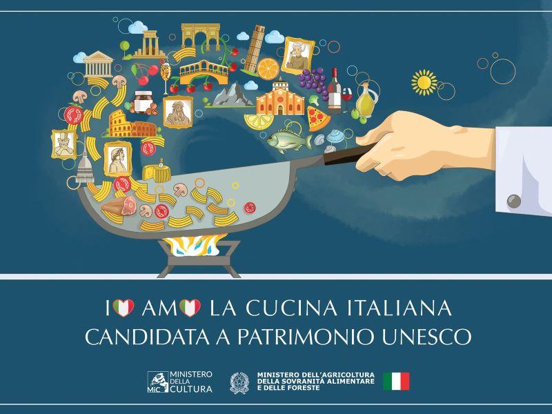
Italian government officials including the Minister of Agriculture, Food Sovereignty and Forestry Francesco Lollobrigida and Minister of Culture Gennaro Sangiuliano recently unveiled the official logo for the candidacy of Italian cuisine for inclusion in the UNESCO Intangible Cultural Heritage list. But not everyone is on board with the way the initiative is being branded.
The illustration is of a jumble of pasta, pizza, cheese, wine and oil being tossed together in a frying pan with some of Italy’s most recognizable icons, including the Leaning Tower of Pisa, the Colosseum, and portraits of famous historical figures. Beneath it is the phrase Io amo la cucina italiana (I love Italian cuisine), with tricolor hearts swapped in for the O’s.
Some commentators, particularly in the art, design and gastronomy spheres, have suggested that the graphic is poorly conceived, particularly in light of the widely panned Open to Meraviglia tourism campaign, which reimagined Botticelli’s Venus as a social media influencer and took now-infamous shortcuts, relying heavily on stock imagery and cookie-cutter graphic design elements.
Writing in Artribune, Giulia Giaume argued that the new logo indicates that the Italian government has ignored the public ridicule of Open to Meraviglia and other recent design flops, including a poorly received new logo for the Ministry of Education. “Despite the fact that [Italy] presents itself as the cradle of design (as well as of cuisine), it insists on ignoring the fact that graphic design is a profession that deserves respect and consideration,” Giaume wrote.
On Artribune’s Facebook page, followers chimed in about the amateurish design. One put it succinctly: Il mestiere di grafico è morto (The graphic design profession is dead), while another offered, Avrei messo una fiamma tricolore sotto la padella (I would have put a tricolor flame under the pan).
The most cynical take on the new logo: L’avranno commissionato all'amico/a dell'amico/a dell’amico/a come al solito. (As usual, they probably commissioned it to the friend of a friend of a friend).
It isn’t just the art- and design-minded who are taking issue with the logo. Writing in the food and wine-focused journal Cronache di Gusto, Gianfranco Marrone called the image a “pastasciutta of stereotypes” and urged reflection on the state of Italian food and wine communication to international audiences.
The UNESCO campaign defines Italian cuisine as a combination of social practices, rituals, traditions and methods based on regional and local flavors that make Italy’s food unique and easily identifiable. Other Italian food-related practices that have been selected for inclusion on the prestigious list are truffle hunting, the art of Neapolitan pizzaiuolo (pizzamaking) and the Mediterranean diet itself. A verdict on Italian cuisine’s inclusion is expected to be reached by December 2025.
What do you think of the logo and the other recent “graphic incidents?” If you were tapped to design a logo representing Italian cuisine, what might it look like? Share your thoughts with our staff here.


